Wedding Bouquet Ideas: The Details That Separate Beautiful from Forgettable
A saved photograph is not a full floral plan. Use these decisions to translate inspiration into a bouquet that fits the actual wedding.
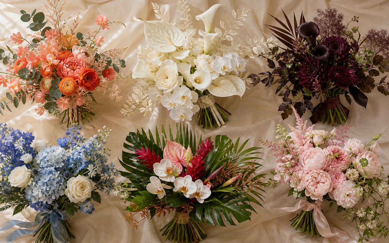
Stop collecting wedding bouquet ideas for a moment and turn the strongest ones into seven decisions: emotional direction, palette, texture, form, attire, season, and venue. A useful bouquet brief says what the flowers should feel like, which visual qualities must stay, and where the florist has room to interpret. That turns inspiration into a design for the actual wedding.
Complete these seven lines before your consultation:
- Feeling: three words the bouquet should express, plus one word to avoid.
- Palette: lead color, supporting color, accent, and foliage or neutral direction.
- Texture: smooth or ruffled, dense or airy, matte or glossy, refined or wild.
- Form: compact or open, centered or directional, upright or trailing, still or loose.
- Attire: the detail the bouquet should echo, contrast, or leave visible.
- Season: the visual result to protect and the flower names that can flex.
- Venue: indoor/outdoor setting, carrying route, portrait plan, exposure, and access.
If you already have a date, venue, attire image, and three annotated references, start a wedding bouquet conversation with Rosa Fiora. Send the seven lines above with the photographs. The notes beside each image matter more than the number of images.
Six visual directions to test against your wedding
These original studies are starting points, not complete briefs. Read each one through the seven decisions above and notice which qualities belong to your wedding.
Warm and airy
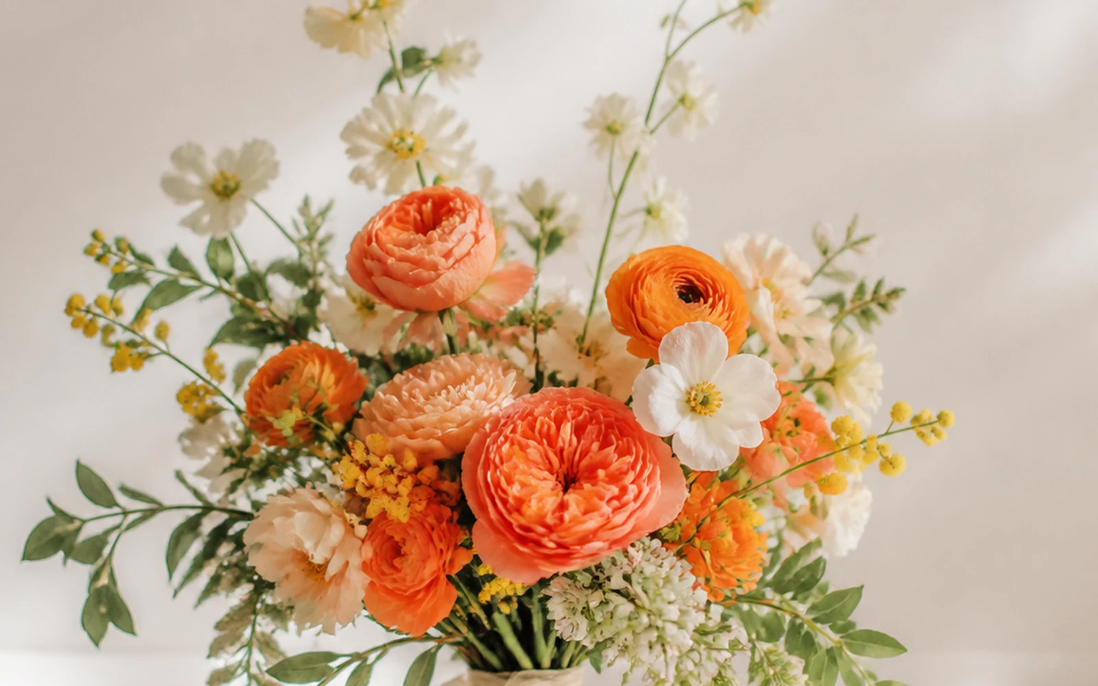
Coral leads, peach supports, and yellow appears in small sparks. Ruffled flowers and exposed stems give the palette room to move.
Ivory and sculptural
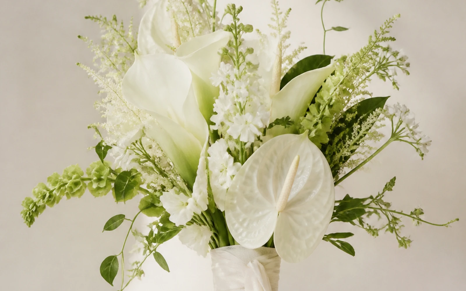
Ivory becomes dimensional through smooth forms, small green accents, and a centered finish rather than through added color.
Plum and architectural
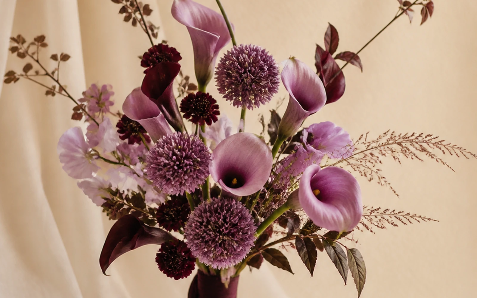
Plum and lavender carry the palette while smooth curves, spherical accents, and one extended line make the composition architectural.
Coastal blue and white
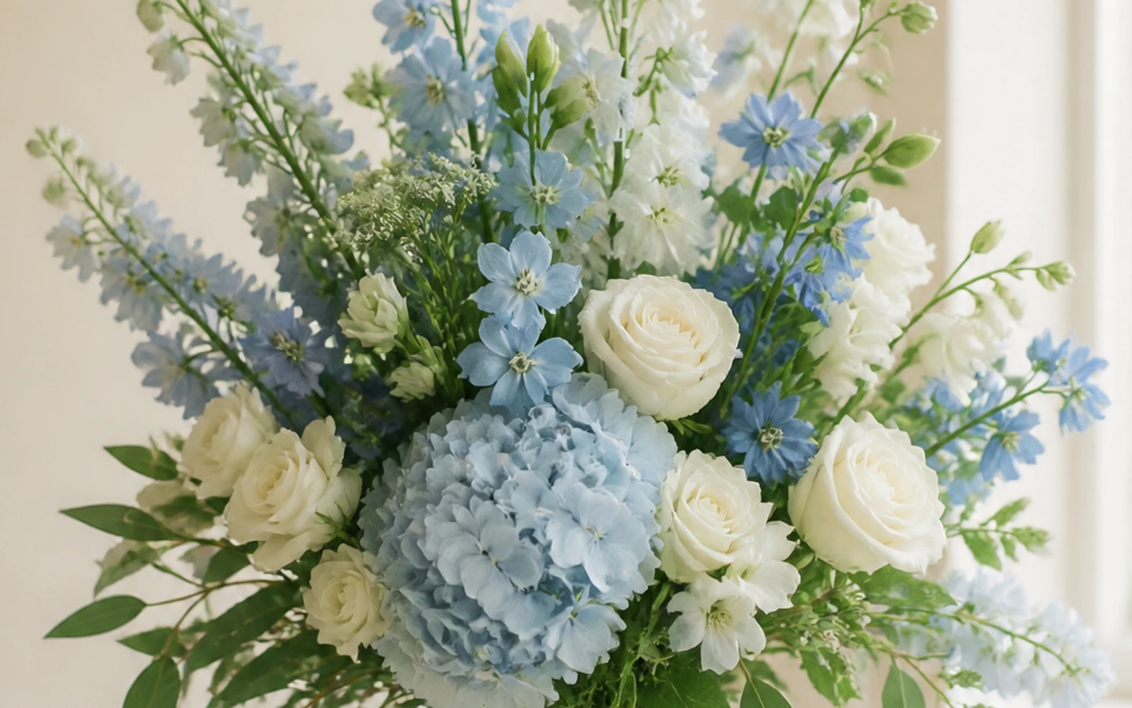
Powder blue, white, and green create a fresh coastal direction through vertical movement and a light, open edge.
Tropical and editorial
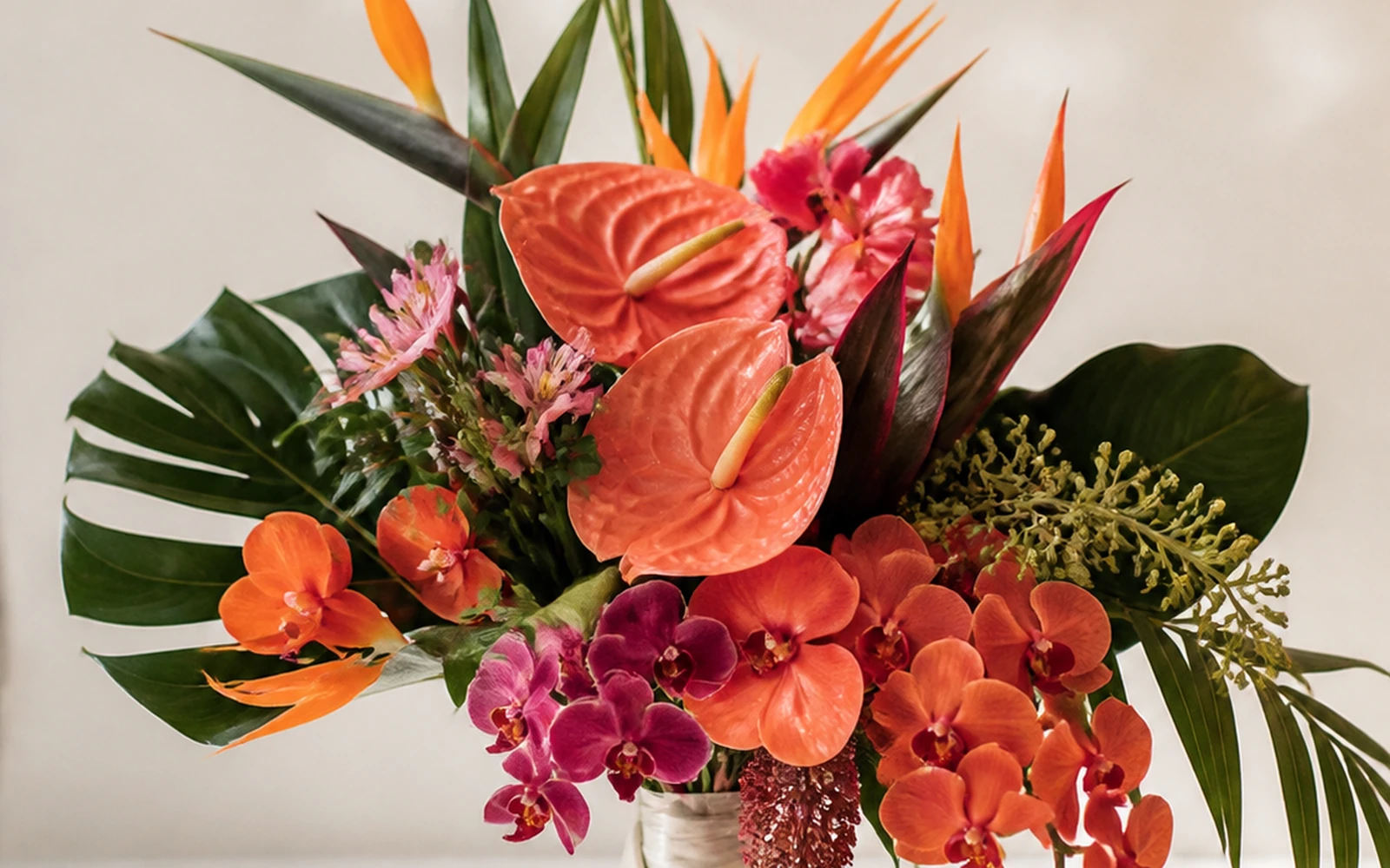
Saturated coral, orange, magenta, and deep green become editorial through glossy sculptural forms and deliberate asymmetry.
Blush and romantic
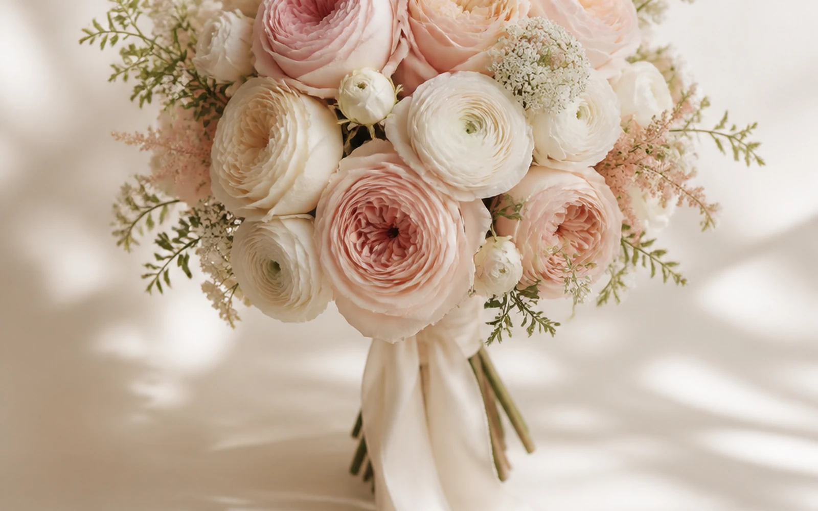
Blush and cream stay romantic through layered ruffled texture, a soft rounded silhouette, and delicate ribbon movement.
The current Rosa Fiora Wedding collection shows how several decisions combine inside one finished bouquet. A vivid coral-and-gold direction can feel airy and energetic through open poppies, rising stock, and exposed stems.
An ivory rose direction can feel relaxed rather than rigid when heights vary, small green accents interrupt the neutral field, and ribbon continues the movement.
A plum direction can become architectural through smooth calla, spherical allium, layered ranunculus, and a strong asymmetric line.
These are completed combinations, not three themes to copy. Use them to see how color, texture, movement, and finish work together.
First, edit every saved image
Open your inspiration folder and write one sentence beside each photograph. Begin with “I saved this because…”
Useful annotations sound like this:
- “I love the narrow ivory palette and the relaxed edge.”
- “I want this amount of air, but with warmer color.”
- “The ribbon movement feels right; the bouquet itself is too broad.”
- “I like the smooth calla against the tiny textural flowers.”
- “The scale works with the dress, while the deep burgundy feels too formal.”
Then delete references that contribute no new information. Five annotated images can reveal a coherent direction. Fifty silent images often contain several different weddings.
I separate the qualities you want to protect from the details you happened to see in one photograph. A reference may owe its impact to studio lighting, a cropped camera angle, a particular dress, or a flower photographed at one exact opening stage. Your notes identify the transferable idea.
Pass 1: Give the bouquet an emotional direction
Choose three adjectives that can guide real design decisions. “Beautiful” contributes little because it describes the desired outcome. Words such as quiet, sunlit, graphic, windswept, tailored, abundant, delicate, playful, moody, or ceremonial create a clearer direction.
Add one rejection word. If your three words are “warm, airy, and joyful,” the rejection might be “sweet.” If they are “quiet, sculptural, and formal,” the rejection might be “rustic.” That final word prevents a visually plausible bouquet from drifting into the wrong mood.
Use emotion before flower names. “Soft” could mean pale color, round petals, low contrast, loose spacing, trailing ribbon, or all five. The next passes reveal which version of softness belongs to your wedding.
Pass 2: Assign every color a role
A long list of favorite colors creates competition. A role-based palette creates hierarchy.
- Lead: the color seen first and carried through the bouquet.
- Support: a neighboring tone that gives the lead depth or softness.
- Accent: a smaller, sharper note used for rhythm or surprise.
- Foliage or neutral: the green, cream, white, brown, or metallic direction that frames the flowers.
For example, “coral, peach, yellow, ivory, and green” leaves the balance open. “Coral leads; peach supports; yellow appears in small sparks; ivory and fresh green keep it airy” gives the florist a composition.
Bring material references alongside digital swatches: attire fabric, ribbon, invitation paper, linen, suit, jewelry, or a photograph of the ceremony surroundings. The bouquet lives beside those surfaces.
Pass 3: Set four texture dials
Texture controls how the bouquet feels at close range. Mark a point on each pair:
| Texture dial | One end | The other end | What changes visually |
|---|---|---|---|
| Surface | smooth | ruffled | graphic clarity versus petal-rich softness |
| Density | dense | airy | continuous floral mass versus visible space and stems |
| Finish | matte | glossy | quiet surface versus visible shine and reflection |
| Character | refined | wild | controlled edge versus irregular reach and variation |
Contrast creates interest. Smooth calla can become more expressive beside rounded allium or layered ranunculus. A mass of ruffled roses can gain clarity from a restrained palette. Air can make a vivid color feel lighter; density can make a pale color feel more substantial.
Choose the dominant direction and one contrast. Filling every bouquet with every texture turns the brief back into a list.
Pass 4: Describe form as behavior
This decision framework needs behavior words rather than an encyclopedia of shape names. Decide how the bouquet should occupy space:
- compact or open;
- centered or directional;
- upright or trailing;
- still or loose.
A compact, centered, upright, still bouquet creates a composed accessory. An open, directional, trailing, loose bouquet becomes part of the body’s movement and the full camera frame. Many successful designs sit between those poles.
When you want the formal names and detailed carrying differences, use the guide to 11 types of wedding bouquets. Bring only the chosen behavior back into this brief. That keeps the inspiration process focused on the whole design instead of turning it into a taxonomy exercise.
Pass 5: Put the attire beside the flowers
The bouquet and attire share one composition. Use a full-length image and mark the details that matter:
- neckline and lapel;
- sleeve shape;
- waistline or tailoring;
- beading, lace, embroidery, draping, or print;
- train, overskirt, cape, veil, or other movement;
- jewelry and any prominent accessory.
Now choose the relationship. The bouquet can echo the attire through similar line and detail, contrast it through cleaner or richer texture, or frame it by keeping key areas visible.
A highly embellished surface may gain clarity from a focused palette and edited flower face. A minimal column can support a sharper directional gesture. A colorful suit can connect to one small accent rather than receiving every color again. These are compositional choices, free from body-type formulas.
For a deliberately restrained scale, write down the intended width, dominant flower-face scale, one main texture, one contrast, and the stem finish. Those decisions give a compact bouquet visual authority and keep the design brief specific.
Pass 6: Turn season into a flexibility plan
Season belongs in the brief as a design conversation, not as a fixed shopping list. Separate the visual qualities that define the bouquet from flower names that can flex.
Write two columns:
| Protect | Discuss with the florist |
|---|---|
| warm coral lead | exact coral flower variety |
| broad ruffled focal texture | rose, peony, ranunculus, or another suitable material |
| fine upright accents | the specific seasonal stem creating that line |
| airy spacing | exact supporting flowers and foliage |
| trailing ivory finish | ribbon material and length |
This makes your priorities visible. If the emotional direction depends on a broad ruffled face and warm coral color, those are stronger instructions than one cultivar name pulled from a saved image.
For seasonal planning, rank the month, color direction, texture, and visual qualities you want preserved through sourcing decisions. Bring that hierarchy back to the bouquet brief.
Pass 7: Let the venue change the decision
A bouquet moves through a real sequence: preparation room, first look, vehicle, ceremony entrance, vows, portraits, reception arrival, and final handoff. Venue and schedule can alter scale, finish, carrying ease, and the holding plan.
For a Miami or South Florida wedding, add one operational line to the creative brief:
That line gives the florist the environment, route, exposure, holding plan, access contact, and portrait sequence without turning the inspiration board into a logistics document. For a coastal setting, add the open-water edge, wind direction, sun exposure, setup sequence, holding point, and movement between indoor and outdoor spaces. For a hotel, condominium, or managed venue, attach the property details requested in Rosa Fiora’s Delivery Policy to the brief.
This is where a consultation becomes specific: the creative direction and the day route arrive together in one usable packet.
Build your bouquet brief in seven answers
Copy this worksheet and complete one line at a time:
- Feeling: [three direction words]; avoid [one rejection word].
- Palette: [lead] leads; [support] supports; [accent] appears in small moments; [neutral/foliage] frames the palette.
- Texture: [smooth/ruffled], [dense/airy], [matte/glossy], [refined/wild]; one contrast is [contrast].
- Form: [compact/open], [centered/directional], [upright/trailing], [still/loose].
- Attire: echo, contrast, or leave visible [specific attire detail].
- Season: protect [color/texture/movement]; discuss [flower names that can flex].
- Venue: [environment], [route], [exposure], [holding place], [portrait sequence], [access contact].
Attach one full attire reference, one venue reference, and three to five annotated bouquet images. Then combine the seven answers into the message sent with the consultation request.
Turn the seven answers into one florist paragraph
Combine the answers in one paragraph:
Attach three to five references with annotations, one full attire image, ceremony and reception images, the date, and a simple day route. That packet gives the florist both creative direction and the context needed to develop it.
A memorable bouquet rarely comes from finding one perfect photograph. It comes from making the seven decisions that let every detail belong to the same wedding. For a deliberately restrained scale, the small wedding bouquet guide applies the same thinking to proportion, flower size, texture, and finish.