How to Plan Corporate Event Flowers Around Your Brand
Build corporate event florals as part of the brand experience through scale, repetition, color, placement, guest movement, photography, and production planning.
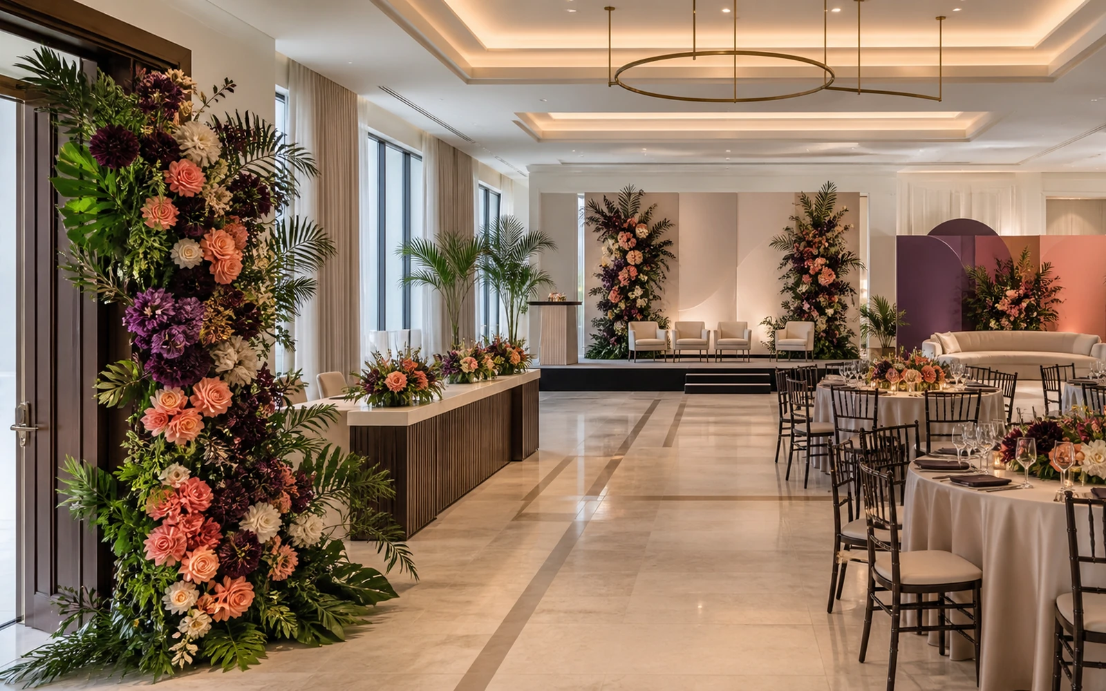
Corporate event flowers work best as one visual system moving through the room. Set the brand tone at the entrance, repeat a recognizable color or shape at key decision points, give the stage a clear floral frame, keep tables open for conversation and service, and place the strongest floral moments where cameras will naturally meet people.
The brief can begin with five outcomes:
| Outcome | Floral decision |
|---|---|
| Guests recognize the event’s visual language | repeat a controlled palette, silhouette, or material |
| Arrival feels intentional | create one clear threshold moment |
| Speakers and screens hold focus | frame the stage with disciplined scale and placement |
| Tables feel connected and usable | coordinate footprint, height, density, and repetition |
| Photographs look like the same event | plan color around the backdrop, logo surfaces, awards, and people |
If you are planning a Miami launch, conference, dinner, awards program, or company celebration, share the event purpose, date, location, palette, room plan, and production schedule with Rosa Fiora early and choose Corporate Flowers as the request type. Rosa Fiora will gladly discuss ongoing workplace designs, branded events, client gifting, and custom floral planning with you personally. Those six inputs turn “corporate flowers” into a spatial design conversation.
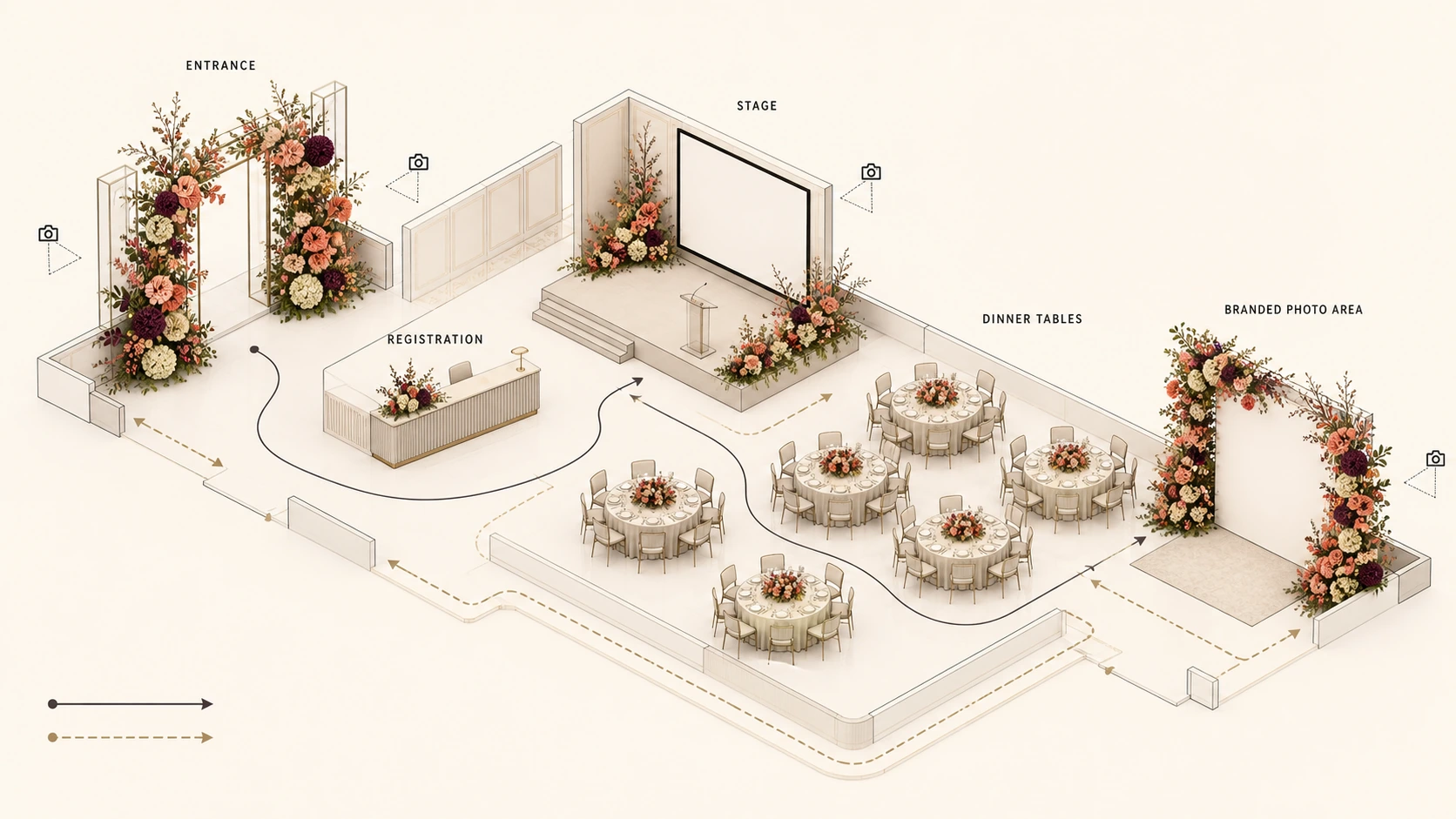
Walk the event in the same order as a guest
A mood board shows ingredients. A guest path gives them a job.
I would review the event from curb or lobby to final photograph and ask what the flowers should accomplish at each transition. The answer may be visual recognition at the entrance, orientation at registration, focus at the stage, warmth at the tables, or a strong branded frame near the exit. Flowers become more persuasive when every placement has a reason to exist.
The approach and entrance
The entrance establishes scale. A single sculptural gesture can announce a focused, modern brand. Repeated grouped vessels can feel conversational and energetic. A low field of one color can create calm visual authority. The right choice comes from the event’s identity and the distance from which guests first see the space.
Connect the entrance to an existing architectural line: a doorway, staircase, registration wall, reception counter, or framed view into the room. That relationship makes the flowers feel built into the arrival rather than set down afterward.
Registration and first orientation
Registration needs visual identity and working space. Carry one cue from the entrance—a flower category, a color interval, a vessel finish, or a repeated vertical line—into a more edited footprint. The floral detail should make the desk belong to the event while leaving room for badges, devices, printed materials, and staff movement.
This is also a useful place to introduce the event’s rhythm. If the entry uses one large coral gesture, registration might repeat coral in two smaller compositions. If the entry is white and architectural, the desk can use a narrow white-and-green line rather than a second statement piece.
Give the room a hierarchy, not equal decoration
A distinct brand experience needs visual peaks and quieter passages. Equal floral weight everywhere makes it harder to understand what matters most.
Choose the primary focal point first. At a conference, that may be the stage. At a product launch, it may be the product reveal or demonstration area. At an awards dinner, it may be the stage plus a portrait location. Once the lead moment is clear, supporting placements can repeat its language at a lower volume.
Frame the stage around content
Stage flowers should strengthen the composition that already includes speakers, screens, lecterns, furniture, lighting, and camera positions. I look at the complete frame before choosing height.
A lower floral mass can ground a wide screen. Asymmetric flowers can balance a lectern or seated interview setup. Controlled vertical accents can carry the eye upward around a tall backdrop. The design earns its place when the speaker remains the focal point and the brand color has a deliberate location in wide, medium, and close camera views.
Ask the production team for the screen dimensions, speaker positions, camera angles, cable paths, scenic elements, and the clear areas they need. Then let the flowers shape the remaining space.
Make tables part of the same visual sentence
Tables translate the stage language into a human scale. Start with table shape, place settings, menu or materials, glassware, service style, conversation lines, and the amount of open surface.
A long table may use repeated low moments that create rhythm down its length. A round table may need one centered footprint or a few tightly edited vessels. A networking table may carry only a small color cue because guests need the surface for drinks, phones, and conversation.
For every table, record sightlines, scale, table shape, place settings, service space, and usable surface. The centerpiece planning guide explains those shared spatial mechanics in more detail; corporate work then adds brand repetition, sponsor visibility, presentation content, and camera composition to the table-level brief.
Design for the photographs the event needs
Photography should enter the floral brief before placement is final. Build a short shot list with the event and media teams:
- guest arrival with the event identity visible;
- speakers with the stage composition in frame;
- awards or presentations with clear handoff space;
- sponsor or product moments with controlled floral color nearby;
- table details that connect to the wider room;
- team portraits or attendee photographs at a designated location.
Then study each frame. A logo wall may need flowers beside or below the usable portrait area. A stage can carry more color at its edges than behind a speaker’s head. An awards surface benefits from clear working room. A bar or networking point can become a lively photo destination through one memorable silhouette.
Color deserves special attention. Brand color can appear literally in flowers, through a related tonal family, or through vessels and ribbon while the flowers provide contrast. A saturated red identity might become burgundy, coral, or warm pink depending on the room and lighting. A blue identity may be carried by vessels and delphinium-like vertical lines while white flowers keep faces and signage visually clear. The goal is a coherent photograph, not a paint-chip exercise.
Build the Miami production route
In Miami, corporate events often move through hotels, condominiums, offices, galleries, restaurants, and other managed properties. Treat the floral route as part of the design brief.
Gather the property name, event room, receiving point, venue contact, security or check-in instructions, loading location, elevator route, approved access period, setup order, and removal plan from the event and venue teams. Review Rosa Fiora’s current Delivery Policy for the address and managed-property details used in a local order.
The route can shape the flowers themselves. A narrow elevator or long interior path may favor modular pieces that come together in the room. A tight setup sequence may place stage pieces before guest tables. A shared loading area may require a precise receiving contact. A hotel ballroom with a separate registration floor needs a zone list so every arrangement reaches its intended location.
South Florida light also changes photography. Strong daylight near windows can make pale flowers read very differently from a dim ballroom or saturated stage wash. Share reference images of the room in its event lighting, plus the media team’s likely camera direction. Palette and placement can then be designed for the room guests will actually see.
Turn the concept into a one-page floral map
A useful corporate floral brief can fit on one page when it is specific. Include:
- Purpose: what the gathering is for and who will attend;
- Brand tone: three precise words, supported by actual color and material references;
- Guest path: entrance, registration, stage, tables, networking, bar, and photo zones;
- Priority order: the lead floral moment, supporting moments, and quiet zones;
- Production inputs: room plan, dimensions, table plan, stage plan, access contact, timing sequence, and removal plan;
- Photography inputs: logo surfaces, speaker positions, awards, sponsor moments, portrait area, and camera views;
- Continuity cue: the color, shape, flower category, or material that repeats across the event.
My strongest recommendation is to decide what guests should visually recognize before choosing individual flowers. A coral rose, white stock flower, sculptural calla, hydrangea mass, or orchid line becomes useful when it carries the brand through the room with intention.
Start at the threshold. Build one hierarchy. Repeat with discipline. Give cameras a clear floral cue. Finish with a production route that every zone can follow.